Peer Reviewing Books and Book Proposals

When a university press contacted me to peer review a book for the first time, I was thrilled. I was recognized by someone as an expert! And being paid for that expertise didn’t hurt either.

Then I was anxious. Did I actually *know* how to write a peer review? I’d published a few articles and book chapters, but the peer reviews I received on them varied WIDELY. On one article, the reviews ranged in length from 480 words 1,726 words. On one chapter, I was told no revisions were needed except for some minor typo fixes that the editor took care of for me. Some reviewers have been off-base enough that editors have told me to mostly ignore their feedback and other reviewers have been so spot on I’ve wanted to weep with gratitude. (Let me take a moment to thank EVERYONE who has left me such thoughtful reviews – you are amazing and I appreciate your feedback so very much.)

Surely presses expected a lot from someone they were paying to review an entire book, but I’d not yet received a monograph-length peer review and had no sense of how they compare to article/chapter peer reviews. What were they expecting? How much did I did to write, and what about? And how much time, in an already very busy semester, would this take from my own research and writing?

The good news is that editors know what they want and are happy to give guidance on that. It’s pretty standard for editors to give you a set of guiding questions to keep in mind while you’re reading and I’ve used those to shape my reviews. You can ask to see those guidelines before agreeing to review a book (they’re not confidential, as far as I can tell) but I’ve also collated a few of the common questions that seem to be asked into four main categories.

  1. Go/No Go? The press will usually ask if you recommend publishing the work and if it makes an important/valuable contribution to scholarship. To my mind, this is the most important feedback I can give them, so I like to start my review with a 1-2 sentences answering these questions.
  2. Argument? The press will also ask you to summarize the argument/thesis and themes of the book. You might be asked whether you think the author actually accomplishes what they set out to argue, or if the author has missed some topic or point of view that is necessary to make the argument. In other words, what do you think is the point of this book?
  3. Organization? The press wants to know if the book makes organizational sense. Are there any long digressions that can be cut? Are there areas that can be expanded? Does the length of the book make sense (should it be longer or shorter) and are all the ($$$) illustrations necessary? This is where you get down to some of the nuts and bolts of how the author proves and supports their argument.
  4. Audience? At the end of the day the press is in the business of selling books, so they want to know who will buy this book. Will it be used in courses (if so which ones) or will this appeal to a general audience? What are the venues where this book should be promoted? Are there other books that this could be promoted alongside or that are in competition with this book? In short, even if this is the best book ever written, someone needs to be willing to buy it.

Those are the main four points I attempt to cover in my main analysis, but when appropriate I also try to include chapter notes (e.g. for a full manuscript review rather than a proposal review). Basically, when I read through the manuscript, I take detailed notes on a chapter by chapter basis which I tidy up at the end and tack on to the end of the main analysis. The “big idea” feedback is very helpful for the editors, but the “hey, you should fix this paragraph, its description of xyz concept is unclear” will be helpful for the revising author when they’re hacking through the weeds.

In closing, I want to turn back to numbers to give some thoughts on how much to write and how long a review takes. Right now I have two data points, but I’ll add more as they occur.

  1. Review 1, full manuscript: this took about 4 days to read, review, and write up my notes. The main analysis was 823 words and the chapter-by-chapter notes were an additional 2741 words. For this, I was offered $200 in cash or books, which works out to 5.6¢ per word or $6.25/hour.
  2. Review 2, proposal + sample chapters: this took somewhere between 2-3 days to read, review, and write up my notes (this happened in the middle of chaos of the COVID-19 pandemic so that time was broken up over multiple weeks and I had to do a lot of re-reading, it should have been faster). The main analysis was 1,166 words and I didn’t include chapter-by-chapter notes. For this, I was offered $100 in cash (or $200 in books), which works out to 8.5¢ per word or $4.16-$6.25/hour.
  3. Review 3: TBA!

I would say the key takeaways of this are:

At least for me, peer reviews always take longer than I expect them to because I’m usually taking far more detailed notes than if I’m reading a book for course prep or my research.

They will go faster if I can find a dedicated chunk of time to work on the review, so the details don’t leak out of my mind, and that’s a factor I’ll keep in mind now when saying “yes” or “no” to a request.

And I’m not going to get rich doing peer reviews! But the money’s not bad, either, and as a bonus I get to read some really cool books. Because, let’s face it. I’m an historian. Most of us are book addicts. When someone asks if I *really need* all those books in my office, the answer is an unqualified yes. And actually, I could use a few more…

The Anatomy of a DH Librarian Job

It’s that time of year again: job adverts begin popping up online, academics polish up their CVs, and all the grad students, contingently employed scholars, and other job-seekers begin praying that they’ll be employed this time next year. I’ve been incredibly fortunate to have been employed by Carnegie Mellon University Libraries for the past four years, first as a CLIR-DLF Postdoctoral Fellow in Early Modern Data Curation on the Six Degrees of Francis Bacon and then as the Digital Humanities Specialist.

When I accepted that postdoc, I had no idea what kind of career path I was getting into, I only knew I wanted Six Degrees to exist! But thanks to two years of careful time-logging and an hour or so of data cleaning and visualization, I can now say a little bit about what a DH job in a university library looks like. With the caveat that every institution (and even similar positions within the same institution!) is different, here’s what it looked like for me at CMU.

The Global Stats

I kept consistent track of my hours from January 22, 2017 through August 11, 2018 for a grand total of 81 weeks.  In those weeks, I worked a total of 3148.2 hours or an average of 38.87 hours/week.  CMU considers “full time” to be 37.5 hours a week, which means I worked 104% of full-time.  Given that academia promotes a culture of overwork, I’m quite proud at the work-life (or should I say, work-medicalDrama) balance I managed to achieve.

The Temporal Stats

CMU allowed me flexible work hours, which is to say that I didn’t need to be in the office 9am-5pm every M-F.  This is a good thing, because I spent almost the entirety of the 81 weeks covered by this analysis in physical therapy.  While I’m happy to talk more elsewhere about disabilities in academia, I’ll just mention here that my flexible working hours were the only thing that kept me from having to go on short-term disability at one point.  So it was a win-win for us both.

As is indicated in this visualization, I did most of my work in the “compressed” work week of Mondays through Thursdays with around 600 hours on each day.  On Fridays, I only managed to do about 2/3 the amount of work I did during those main work days, but I did another 1/3 of that amount each on Saturdays and Sundays.  The lack of productivity on Fridays is disappointing (but unsurprising – I always felt burnt out on the week by Friday) because those were supposed to be my dedicated 20% personal research days.  However the Saturday/Sunday rebound shows that I did get the work done, just at a slower weekend pace. Not all weekend work was research though; those hours also includes conference travel.

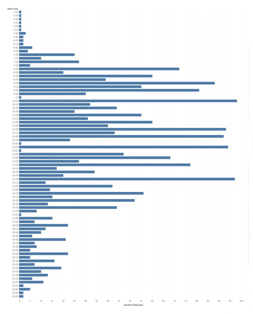
One of the most surprising things I found in my data was that, despite my assertions about not working 9am-5pm, I actually did manage to do most of my work during a normal working day of 8am-4pm. The earliest hours generally reflect conference travel (and if you check out the interactive version of these visualizations via Tableau Public you’ll see one that includes duration alongside start time which shows this) along with a smattering of email checking. While my regular working day sometimes started as early as 6:30 or 7am, my activity levels really spike in the 8-9am period. That slight downtick around 11am reflects my zealously guarded lunch break, while my afternoons had a lot of meetings that started on the hour rather than the quarter or half hours. My activity levels start to drop after the 3pm meetings, but you can still see quite a lot of late afternoon and evening hours that I worked, sometimes up until almost midnight.

The Categorical Stats

That’s nice, you might be thinking, but WHAT did I actually do during my working hours? While many library positions have defined “percent times” that are supposed to be spent on any particular activity, my dean took the position that faculty should have the freedom to determine their own priorities.

In practice, my time broke out into

  • 15% – professional development, including conferences
  • 13% – digital projects, including Six Degrees of Francis BaconDigits, and the Bridges of Pittsburgh
  • 13% – dSHARP digital scholarship center, including co-writing the proposal to found the center, outreach and networking, setting up the administrative infrastructure for the center to run, organizing and running events, and our weekly “office hours”
  • 12% – communication (particularly email… so much email…)
  • 11% – travel (both around Pittsburgh and to conferences)
  • 7% – consultations, library meetings, book orders, and other library administrative tasks
  • 6% – teaching (guest lectures, managing independent studies, and workshops)
  • 5% – personal research
  • 4% – “other,” which is my category for activities such as networking, organization, and documentation
  • 3% – committees

If I were to collapse that down into more “global” categories, I would characterize this as:

  • 39% – dSHARP, consultations, communication, committees, and other library administration/service
  • 33% – research, digital projects, and professional development
  • 11% – travel (both around Pittsburgh and to conferences)
  • 6% – teaching (guest lectures, managing independent studies, and workshops)

(For the eagle-eyed mathematicians among you, the missing 11% were holidays and paid time off, aka vacation days, and yes I took real vacations.)

When I put it that way, it’s clear my job was awesome! But for folks who haven’t spent a lot of time working in a library or on digital projects, it may not be entirely clear what I actually mean when I talk about co-running dSHARP or collaborating on a digital project. For that, my sub-categories will be far more revealing of my day-to-day reality.

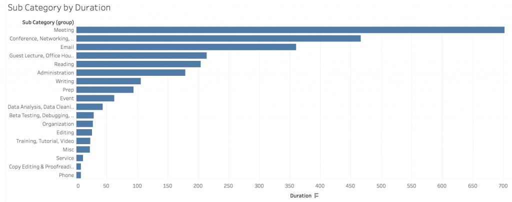
By far the majority of my time was spent in meetings, at 22%, followed by 15% of my time spent at conferences and networking/performing outreach. You can really see my communications preferences as well – I spent 11% of my time emailing people, making it the third highest sub-category, while phone communication barely squeaked onto the visualization. Guest lectures and consultations total 7%, while administration (aka filling out paperwork and creating/documenting center workflows) is only 6%. That last stat really surprised me because it felt like so much more of my job! Then again, that translates to 178.8 hours of paperwork, so it was a significant effort despite its low percentage.

Take-Aways

There are a number of different conclusions that could be drawn from this data, but the ones I would highlight are

  1. This job enabled me to maintain a very good work-life balance.
  2. While my flexible working hours were essential to being able to work continuously through my health problems, I did the majority of my work during a regular 8am-4pm workday. That said, I also did significant work on weekends and evenings.
  3. I spent 1/3 of my time on research and professional development.  Not all library jobs have a significant research component, but many of them do, especially in institutions where librarians have faculty status.
  4. Most of my research time was dedicated to collaborative digital project work and I didn’t manage to carve out as much personal research time as I would have liked. That boils down to my personality, specifically prioritizing external collaborative deadlines over self-imposed personal deadlines.
  5. Because of the intensively collaborative nature of my work, I spent a lot of time in meetings and emailing people. A lot of time.

At the end of the day, CMU Libraries was an awesome place to work and a great career move for me.  It played to many of my strengths while giving me significant flexibility in terms of when and where I did my work.  So for any PhD job-seekers who’ve made it this far and feel like this might be the kind of position for them, I’d highly encourage you to check out the CLIR-DLF Postdoctoral Fellowship Program, which seeks to provide PhDs with practice experience in libraries and an entry into library-based careers.  And for the rest of you, I hope this peek into the world of librarians was interesting and gives the digital humanists among you some ideas for future collaborations with a librarian on a campus near you.

Quantitative, Computational, Digital: Musing on Definitions and History

I recently ran across a trifecta of adjectives: “quantitative, computational, and digital” history. It intrigued me enough that I did an internet search which gave me precisely 4 hits, 3 of which were for the same job posting. Clearly this isn’t mainstream yet.

That said, the phrasing really resonated with me on a number of levels and continued to haunt me to the point where I finally decided it was worth writing about at a bit of length.

I am, at the end of the day, a quantitative historian – numbers are integral to both my sources and many of my methods. When I first encountered demographic history in grad school, I instinctively called it “history by numbers” and critiqued sample sizes while interrogating authors’ calculations. My dissertation and first book project analyze early modern British numeracy and quantitative thinking, while my current DH project involves quantification at a massive scale (Death by Numbers: building a database out of the London Bills of Mortality so that I can examine, among other things, early modern people’s addition skills).

As needed, I am also a computational historian – methodologically I use statistics and computer programming on a semi-regular basis. My work on the Six Degrees of Francis Bacon project involved statistical work in R, as well as less quantitative programming in PostGreSQL, Ruby/Rails, JavaScript, HTML, and a sprinkling of Python for good measure. The bibliometric work I’ve done on Identifying Early Modern Books was also fundamentally computational as is much of the work I’m doing on Death by Numbers (I’m not calculating with nearly a million numbers by hand!) And my newest project, the Bridges of Pittsburgh, will involve a variety of pre-existing softwares as well as probably some bespoke programming for the graph theory aspects. Some of these computational methods are clearly also quantitative, but not all of them.

Lastly, by my actual title and job description, I am a digital historian – for whatever contested definition we give for DH. Increasingly, I and my colleagues in the Pittsburgh area have been scoping DH and digital scholarship projects using the criteria of web-facing, which plays out interestingly against the other two terms I use above. By these definitions, the digital is often but not always computational. An Omeka exhibit or WordPress site is digital but not particularly computational (in either the quantitative or programmatic sense). And if we define digital as web-facing, then the computational is not always digital. An example of this disjunction could be found in any computational project that ends with a traditional article or monograph publication rather than a sustained digital project.

Cue Venn Diagram to visualize the way I’ve been thinking about these similarities and differences… c’mon, you knew this was coming, didn’t you? Venn

So where does this leave DH (and Humanities Computing, Quantitative History, and the like)? Not a clue, hence the reason I called this a “musings” post. This will certainly not be the last (virtual) ink spilled on this very-contested and interesting subject of definitions. In the meantime, I will continue to enjoy my liminality and try on adjectives to suit my research objectives of the moment – be they qualitative, quantitative, computational, digital, or something else entirely.

Never Use White Text on a Black Background: Astygmatism and Conference Slides

TL;DR – never use white text on a black background in your slides.

This post has been a long time coming. Every conference I go to, there will be at least one (and more often ten or twenty) presentations that use white text on a black background. These slides range from hard-to-read to outright illegible and in particularly bad set-ups are so visually painful that I have to close my eyes or turn away from the projection screen. Even conferences that provide advice on designing accessible presentations nod at the “make slides high contrast” but are silent on the white text issue. So! Here it is.

The facts:

  • approximately half the population has some degree of astigmatism
  • white text on black backgrounds creates a visual fuzzing effect called “halation”
  • halation is known to reduce readability of text and is particularly bad for people with astygmatism

The visual aids:

you.jpgme.jpg

full-text2.png

So please, everyone, strike white text with black backgrounds from your color repetoire, the same way you’ve removed color combinations that are illegible to color-blind people. It’s not a question of preferences, it’s an accessibility issue.

Conference Strategies for the Shy and Introverted

So, a comment on Twitter last night made me realize how many strategies I’ve developed over the past few years to deal with being shy and introverted in a conference environment. To anyone who has met me and is laughing at the thought of me being either shy or introverted? I rest my case as to the effectiveness of some of my strategies! Caveats that these are still very much a work in progress, they function best at small-to-midsize conferences, and I don’t always practice what I preach 🙂

So, without further ado, some strategies that will hopefully be of help to other folks as well:

1) Remember that self-care is more important than “networking.” If you start to hit the end of your abilities to cope with people and bounce off a reception/event/invitation, don’t beat yourself up over it. It takes me much less time to recover from oversocialization if realize I’m at my limit and manage to step back before crashing.

2) Find a conference buddy who is willing to be your social “home base” for some of the breaks, meals, and group events. Ideally said conference buddy will be less shy/introverted than you are, and/or know a few people you don’t and can introduce you to them, but that’s not necessary. You just need someone you can hang out with so you don’t feel socially isolated.

2a) If you have a really good friend, you can also room with your conference buddy to save money and improve the ease of schedule coordination.

3) If possible, make plans to eat with folks in advance. I find that figuring out group meals is one of the most difficult parts of conference networking because it’s far harder to casually fall into a meal group than to have a quick chat during a coffee break.

4) If you’re alone during breaks/receptions, you can hover for a bit (a minute or so is usually my max) near groups of people that are having interesting conversations and/or include someone you sort of know. Sometimes the circle will organically open to include you.

4a) If you’re in one of those groups and see someone hovering alone, physically move a bit to open the circle and give them space to join you. Introverts helping out other introverts for the win!

5) If starting up an in-person conversation with strangers is too hard, try chatting to folks on Twitter during panels then going up to meet them afterwards. “Hi, we were just talking on Twitter earlier and I wanted to introduce myself in person” makes meeting new people a lot less stressful, especially if you can then continue a conversation you started online.

6) Acquaintance chaining works. You know one person who introduces you to a person who then introduces you to another person and suddenly you hit the point where you start to know a lot of people.

7) Reassure yourself that communities build over time. The first several conferences can be hard, but eventually you’ll hit a tipping point where you’ve met enough people in the community that things get easier. They never get EASY but if conferences were easy, then we wouldn’t be introverted, now would we?

Twitter at the Big Three: Global Network Stats

Every year in the break between Fall and Spring academic semesters, tens of thousands of scholars from across the world descend on an American city for several caffeine-fueled days of panels, receptions, job interviews, and social networking. Actually, this happens more than once, as members of the American Historical Association, the Modern Language Association, and the American Library Association all meet in January. And while most of their social networking happens face-to-face, some of it happens on Twitter where enterprising digital humanists armed with Martin Hawksey’s TAGS can collect conference tweets and analyze them for fun and profit.

Posts in this (intended) series include (and will be linked as they are published):

  1. Global Networks Stats
  2. Bipartite Network Analysis
  3. Directed Network Analysis
  4. Preliminary Conclusions (TL;DR)
  5. The Methods Post

So without further ado, here are some initial stats about the networks I constructed from the three official conference Twitter hashtags: #aha17, #mla17, and #alamw17.

The AHA network is the smallest at 2,826 nodes (people who either tweeted or whose twitter handle showed up in another person’s tweets) and 6,945 edges (connections generated by said tweets). These edges have been weighted so that if Person A mentions Person B 14 times in tweets, the edge from Person A to Person B has weight 14. If Person A mentions Person C only once, the edge from Person A to Person C has weight 1. The average degree is 2.5 (number of edges divided by number of nodes) but when weight is factored in (edges are multiplied by their weight before added and divided by number of nodes) the average weighted degree is 3.9.

There are 74 connected components (subnetworks with no connection to the rest of the network), with the largest connected component containing 90% of the nodes and 96% of the edges in the overall network. This component has diameter 10 (the shortest distance between two people furthest away from each other) and average path length 4.3 (average of the shortest distance between every pair of people in the network).

The MLA network is slightly bigger and slightly more connected:

  • nodes: 3,538
  • edges: 10,178
  • average degree: 2.9
  • average weighted degree: 5.2
  • connected components: 70
  • largest connected component contains
    • nodes: 94.2%
    • edges: 97.8%
  • diameter 12
  • average path length 4.4

The ALA network is the largest and most connected:

  • nodes: 7,851
  • edges: 20,505
  • average degree: 2.6
  • average weighted degree: 3.9
  • connected components: 99
  • largest connected component:
    • nodes: 96.1%
    • edges: 98.9%
  • diameter: 14
  • average path length: 5.4

So what happens when we put it all together?

bigthree
Green edges = #aha17 hashtag. Red edges = #mla17 hashtag. Blue edges = #alamw17 hashtag.

Merging the three networks together creates some overlap of nodes (people on Twitter during more than one conference) and edges (people tweeting to the same people at more than one conference) but the three networks remain largely discrete. The force atlas 2 layout I employed in Gephi created more overlap of the AHA and MLA conferences than the ALA conference, but in general disciplinarity is the rule of the day.

While some of this is likely an artifact of most scholars’ inability to physically attend multiple conferences (the AHA and MLA, in particular, occurred at the same time in Colorado and Pennsylvania respectively), scholars have the ability to interact via Twitter with conferences they aren’t attending. The co-occurrance of the AHA and MLA could have – theoretically – increased connectivity between the two conferences if similar themes and conversations arose at both then connected via social media. Alas, I don’t have the 2015 metrics (the last time these conferences didn’t co-occur) to do a comparison, but if anyone has them and wants to share I’d love to see them!

In general, the merged “Big Three” network stats clearly derive from their constituent conferences’ stats:

  • nodes: 13,489
  • edges: 37,308
  • average degree: 2.8
  • average weighted degree: 4.5
  • connected components: 203
  • largest connected component:
    • nodes: 95%
    • edges: 98.3%
  • diameter: 16
  • average path length: 5.9

One of these numbers, however, immediately jumped out at me as not like the others: the number of connected components. If only the largest connected component of each conference network had been able to connected in the Big Three network, there should have been 74+(70-1)+(99-1)=241 connected components. Instead, 38 of the small components in the conference networks appear to have merged with another component (either the largest connected component or another small component).

This is encouraging to me as it implies that there is an interdisciplinary scholarly community that emerges on Twitter, not just in the dense “center” of the network but also in the disconnected “margins.” In is not (yet?) clear whether this interdisciplinary community is generated by digital humanists, librarians, geographical proximity, common interests, or – most likely – some combination of factors, including some I haven’t considered.

Regardless of the cause, something is going on. In the interests of exploring it, next time I’m going to restructure my data as a bipartite network to see if anything else interesting emerges.


Conferences and Invisible Disabilities

For two decades, if you suggested that I was disabled, I would have given you a strange look and a skeptical, “okaaaay?”

Sure, I have asthma and have to take meds twice a day (okay, six times a day during flare-ups) but that is as normal to me as brushing my teeth twice a day. And yes, I am intimately familiar with the emergency departments of six different hospitals, but that’s because I’ve moved a lot. And sure, there are a lot of things I haven’t been able to do because of my asthma, but I’m not the kind of person who wants to hang out in a bar or go clubbing on a regular basis or attend academic conferences-

Yeah, I hope I just made you do a double-take.

What do the History of Science Society; the North American Conference on British Studies; and the Society for the History of Authorship, Reading, and Publishing have in common? Besides being awesome professional societies (or I wouldn’t belong to them!), they have all held conferences that I attended where I suffered severe respiratory distress because of the asthma-unfriendly cities they chose for their conferences.

I’m not going to sugarcoat it. When my co-collaborators and I decided we wanted to present our work at SHARP and then I realized the conference was in Paris, I nearly burst into tears because dear God, I didn’t want to have to suffer through an asthma attack on purpose. It took me four weeks to recover from that conference in Paris last summer. I almost didn’t apply to present at the Alliance of Digital Humanities Organizations conference next summer because it’s going to be in Montreal, which isn’t quite as bad as Paris, by which I mean it’ll probably “only” take me a week or so before I can breathe normally again.

So this is a plea for conference organizers to add more items to a checklist that, I appreciate, is already pretty long! But if you want your conferences to be truly accessible, you need to take into account the invisible, as well as visible, disabilities.

  1. Do you know what the air quality is like in the city you’ve chosen for your conference? Hint: if it’s a city where cigarette, cigar, and/or marijuana smoking is socially acceptable, it’s not going to be good. Also, think about vehicle and manufacturing exhaust, and the likelihood of wildfires. No, you can’t work miracles – cities are cities – but you should be aware of the situation, know when you’re choosing a venue that will potentially hurt people attending your conference, and keep your attendees informed about potential air quality issues.
  2. Is the hotel you’ve chosen strictly non-smoking? Because, let’s face it, any hotel with smoking rooms is going to cross-contaminate the non-smoking rooms, even if it’s just via the laundry.
  3. Is your meeting venue attached to your hotel? Or will attendees have to go outside, running the “smoker’s gauntlet” that inevitably springs up right outside hotel doors? Because not everyone can hold their breath and run – and frankly, we shouldn’t have to.
  4. Does your hotel AND meeting venue have year-round climate control? Yes, that means air conditioning in the summer, even in northern climates. Because asthmatics can’t just “open a window” and the lack of climate control leads to issues with humidity and mold growth, air circulation, and other asthma-attack-inciting conditions.

That’s it. Four things to keep your conference attendees from having to choose between their careers and their health. Because we all like to breathe.

I Tweet Therefore I Am Paying Attention

While I’m not on Twitter daily, I am a very active conference tweeter. I’m one of those people sitting by the electrical outlet with my laptop, hastily typing as the speakers present. To give you a better sense of the dichotomy between my everyday and conference tweeting, I present a screenshot of my July Twitter analytics:

tweet_activity

Can you guess when SHARP 2016 occurred?

I’ve had a few people ask me about conference tweeting. What am I doing? Why? And – most importantly – how can I listen and tweet at the same time?

Conference Tweeting 101

The idea is straightforward. As you listen to a speaker, you extract the main ideas, themes, questions, and illuminating examples. You then tweet these things, ideally each one in a single tweet but breaking it across multiple tweets is also an option if the idea is especially complex.

Because all good academics cite their sources, the format of these tweets tends to be something like “Name: idea expounded here #conferencehashtag” or “idea expounded here @speakersTwitterHandle #conferencehashtag”  Session hashtags sometimes emerge at more Twitter active conferences, to separate out the conversations happening around each panel.

tweet

Whenever possible, it’s best to include the speaker’s Twitter handle because this means they will be automatically notified of your tweet (and be able to see other Twitter users’ interest in their ideas). They will also be included in any conversations that happen because someone responds to your tweet. HOWEVER for that to happen, the speaker needs to tell the audience what their Twitter handle is.

Pro Tip: if you have a/v and want your talk to be tweeted, it’s best to include your Twiter handle at the bottom of every one of your conference slides.

The Benefits of Conference Tweeting

… are legion. Because I want to keep this short, I’ll stick to my top two.

You can’t be in more than one panel at a time, assuming you can even afford to attend the conference in the first place. Conference tweeting allows you to “peek” into other panels, spot synchronicity of themes across multiple panels, and virtually attend far more scholarly events than even the most generous professional development stipend could allow.

Social network visualization

Furthermore, conference tweeting is a fantastic way to network – to find people with like interests and spark conversations that begin online, continue in receptions, and last after that conference ends. I’ve had collaborations and future conference panels emerge organically from these conversations, in a way they never would have if I’d sat alone in the back of a conference room then quickly escaped that reception full of strangers

The Concentration Question

This is the question I get asked most often and I’ll give a longer version of my usual response. We train all our academic careers to take notes while listening to lectures and other auditory events. In fact, this is a skill I’ve practiced so long, I have to take notes in order to actively listen to a talk. If I’m not taking notes, I tune out. And for me, conference tweeting is a form of note-taking.

When the Internet connection’s bad, I still take notes in a text document, but I vastly prefer note-taking via Twitter. First, I almost never go back to look at my old notes but I do continuously reenage with old tweets either because someone’s liked/retweeted something or because I’m analyzing datasets of old conference tweets.

Image of conference tweets archive
Tweets Captured with TAGS v6.0 ns

Second, Twitter functions as essentially a communal note-taking platform, enabling me to see what other people are getting out of the same talk. Third, the public nature of this note-taking leads to immediate conversations with other conference tweeting, in which we dissect, analyze, and expand on the ideas we’re hearing together.

So the next time you’re sitting in a conference next to me or anyone else who has Twitter open in the browser, you’ll know: I tweet therefore I am paying attention.